Well.
Editorial
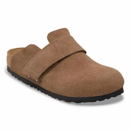
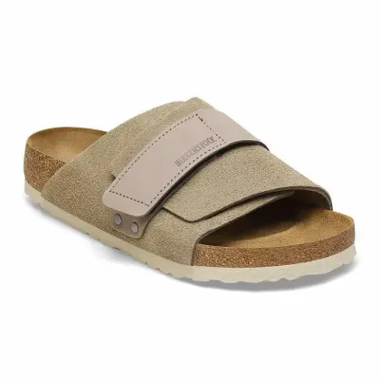
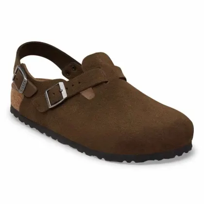
Cream paper, enormous Didot headlines and a lot of empty space. Products sit in a two-up grid that steps up and down like a spread. The kind of restraint that makes a ₦82,000 clog look like it is worth it.
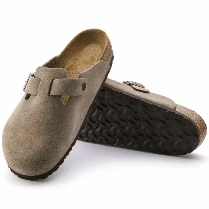
All five are working prototypes, not pictures — you can browse, filter, open a product, choose a size and fill a bag in every one. Same eight products, same brand palette, five different personalities. Open them, then tell me which one feels like SSOLĒ.
Cream paper, enormous Didot headlines and a lot of empty space. Products sit in a two-up grid that steps up and down like a spread. The kind of restraint that makes a ₦82,000 clog look like it is worth it.
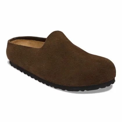
The shop as a reference list: hairlines, tabular prices, a reference number per style. Run your finger down the rows and the photo on the right changes as you go. Best direction if customers know what they want and hate scrolling.
Soft cream, rounded cards, gentle shadows. Quick-add buttons, wishlist hearts, star reviews, a real bag page with a promo field. This is the direction that converts strangers — it feels like a shop that will actually answer its WhatsApp.
Espresso ground with the products lit on ivory plates, like a vitrine. Tan accents, a slow scrolling reveal, a full-screen bag takeover. Since your photos are shot on white, the plates are what make a dark site work — no muddy cut-outs.
Built the way a phone app is: all four tabs render once at start and stay alive, so switching between them takes 0.2 ms and zero requests — and each tab keeps its scroll position. Products open as a sheet over the shop. This is the direct answer to “tap a page and have it load almost instantly”.
No framework, no webfonts, no analytics. One shared product file, photos converted to WebP at two sizes, and pages drawn from data already in the browser instead of fetched again. That is where the half-second comes from.